
Printing a QR Code That Scans the First Time
Size, contrast, margin and placement: the practical rules that decide whether your printed code works or gets an awkward second attempt.

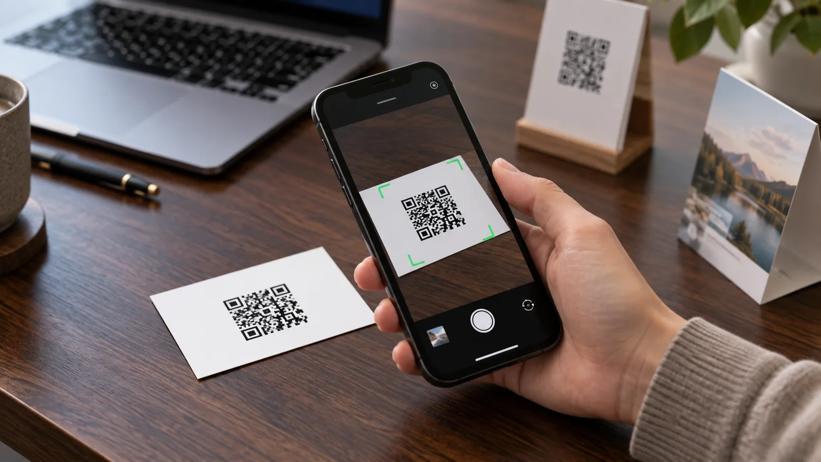
There is a particular silence when someone tries to scan your code and nothing happens.
They tilt the phone. They move closer. They move further away. You apologise. On the third attempt it works, or they give up and ask for your number instead.
Almost every failed scan comes down to a handful of printing decisions made before the code ever reached paper. Here they are.
Rule One: Leave the White Border Alone
A QR code needs empty space around it, called the quiet zone. The specification from DENSO WAVE, the company that invented the QR code, calls for a margin four modules wide on every side, a module being one of the small squares the code is made of.
That border is how the camera finds where the code ends and the rest of the world begins. It is also the first thing designers trim, because it looks like wasted space.
Do not trim it. And never place a code directly onto a photo, a pattern or a dark background without its own light border. On a busy surface, a code with no quiet zone may not scan at all.
Rule Two: Size It for the Distance
The further away the scanner, the bigger the code needs to be. A common rule of thumb is a ratio of about ten to one: a code 2.5 cm wide scans comfortably from around 25 cm away.
In practice:
Business card: it is held in the hand, so 2 to 2.5 cm is usually enough.
Table stand or counter sign: scanned from arm's length or a little more; go larger.
Banner or booth wall: people scan from across an aisle. Measure the distance, divide by ten, and then add some.
When in doubt, print a test and scan it from where your audience will actually stand.
Rule Three: Dark on Light, With Real Contrast
Scanners are built for dark modules on a light background. Brand colours are fine as long as the code stays clearly darker than what surrounds it.
What causes trouble:
Light on dark. Inverted codes are read by many phones but not all. Do not bet an event on it.
Two similar colours. Navy on black, or pale grey on white, look elegant and scan badly.
Glossy finishes and foils. Under exhibition lighting, a reflection across the code hides part of it. Matte is safer.
Rule Four: Shorter Links Make Better Codes
The more characters in the link, the more modules the code needs, and at the same printed size each module gets smaller.
A long address full of tracking parameters produces a dense code that struggles on a small card. A short link produces a simpler pattern with bigger squares, which scans faster and from further away.
Rule Five: A Logo Costs Something
QR codes carry built-in error correction. The standard levels restore roughly 7, 15, 25 or 30 percent of a damaged code, and DENSO WAVE notes that 15 percent is the most commonly chosen.
A logo in the middle works by deliberately covering part of the code and relying on that correction to fill the gap. It is fine, provided the code uses a higher correction level and the logo stays modest. Every square the logo covers is margin you no longer have for a scratch, a crease or bad light.
Rule Six: Print Something That Can Change
The last rule is not about printing at all. If the code points straight at a page you might replace, every card in circulation breaks when you do.
A dynamic code points at a short link you control, and you change where the short link goes. The printed code never changes. We covered this in detail in Never Print a Link You Might Change.
How POPINID Handles It
POPINID QR codes point at short popon.id links, so the pattern stays simple and you can change the destination after printing. Downloads come as PNG or SVG at print resolution with the full four-module white border already built in, and adding a logo automatically switches the code to the highest error correction level.
Before You Send Anything to the Printer
Keep a white border around the code on every side.
Size it for the distance people will scan from.
Use a dark code on a light, matte background.
Use a short link.
Keep any logo small.
Print one test and scan it with two different phones.